
Interesting trends in the Dutch Real Estate
The premise ...
With my plan to settle long-term in the Netherlands at the back of my mind, I quickly realized that owning a house as an asset in the Netherlands would not only provide a stable abode but also be an asset for the long term. However, after reading blogs/articles quite a bit, about the whole housing situation in the Netherlands, I realized the sad truth behind what one of my work colleagues joked, 'Samadarshi, you will need more than a lifetime of savings to buy a house here which someone previously bought with money worth two chickens and a sack of potato'.
Yet the curious child inside me was undeterred and urged my consciousness to take a look into the statistics by myself. I was more interested in the lesser-known facts about the housing market beyond the fact that the Randstad is the costiest place to buy property. So, on a beautiful Friday afternoon, armed with a few cups of hot chocolate, I scraped the 'largest listing website of the Dutch Real Estate'. It yielded about a few GB of data (around c.a. 10k listings) and over the following weekend, I cleaned, extracted, and tabulated a few key parameters from the listings to perform my analysis.
To those curious about the scraping strategy: I used BeautifulSoup and Selenium packages in Python. I will not make this code public to protect the commercial/business interests of the website owners. However, the final tabulated data and the analysis code are available in this GitHub Repository and can be used for personal (non-commercial) or education purposes (please send me a private request to do so.)
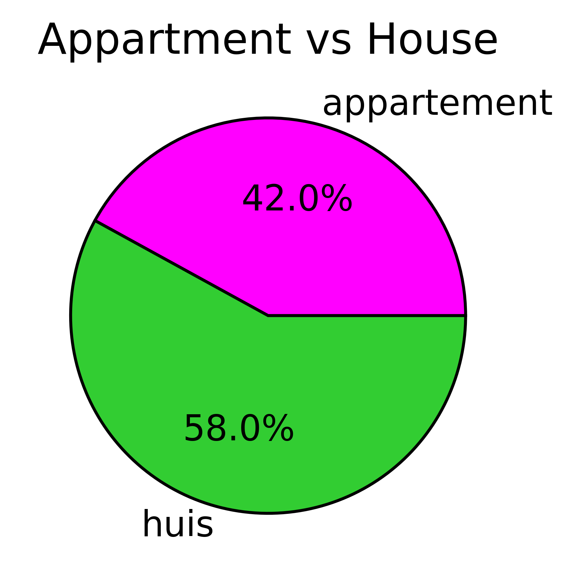
Well, that being said… I will summarize here a few of my key findings and of course, you are very welcome to have a look into the data from my repo as well. First, little less than half of the listed houses are apartments and the majority of them are bungalow houses (see Fig 1).
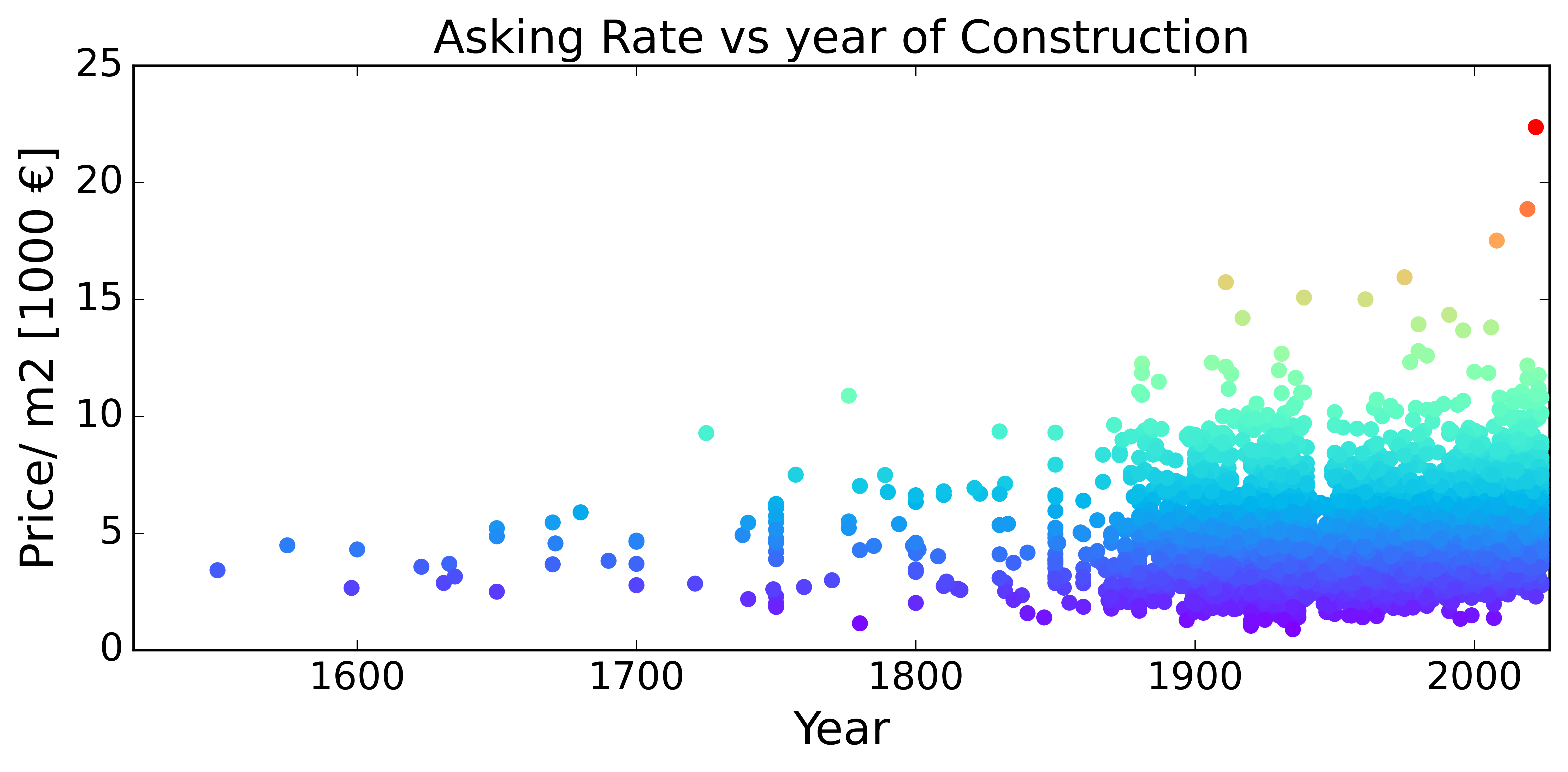
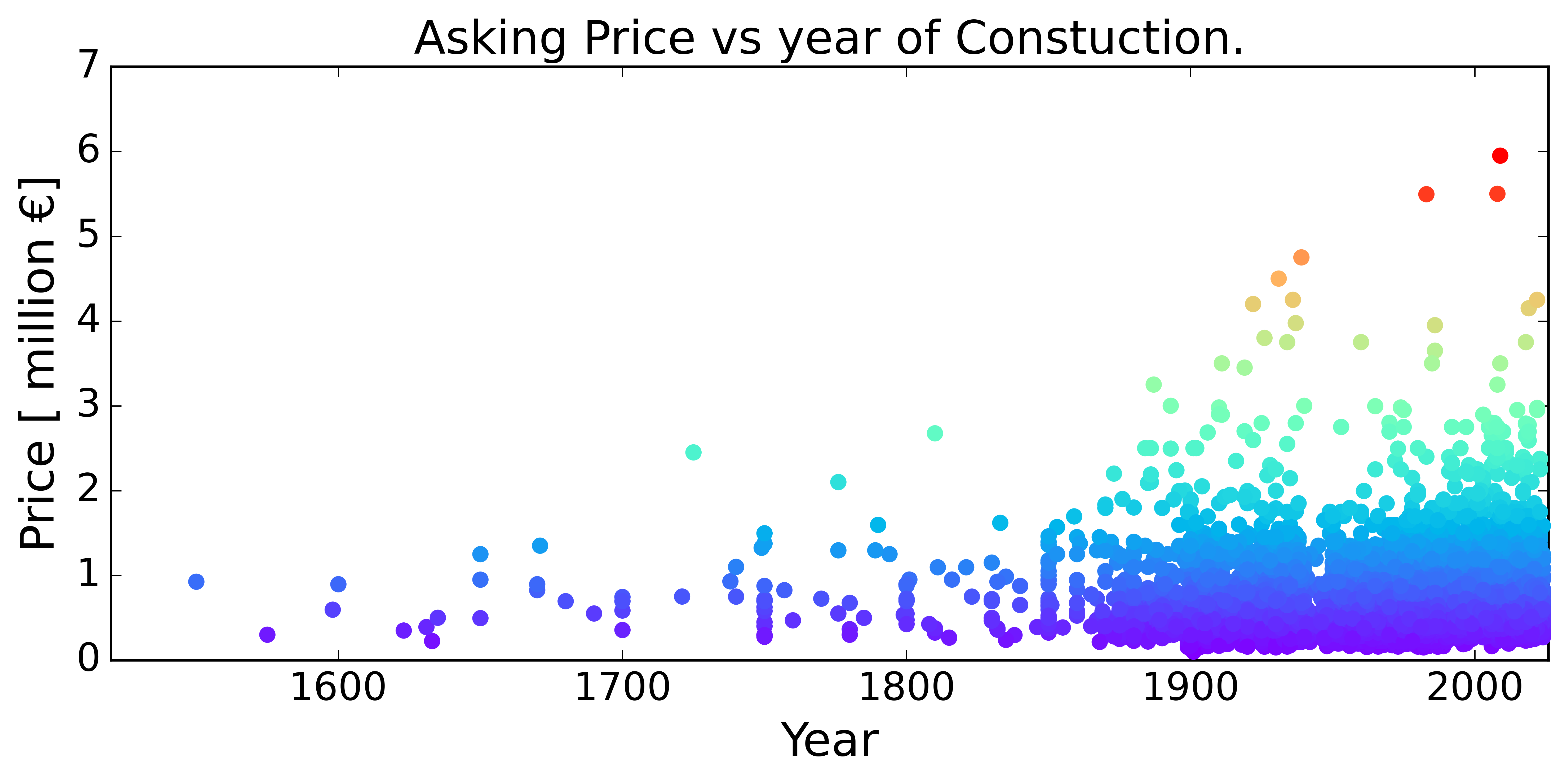
There are very old houses in the Netherlands that are currently being sold. By old, I mean from the 16th century (historical ones). On average the Price and Price/m2 ( Fig 2(a) and (b) resp.) is on average lower than older houses. Also, the costliest houses are the most recently built (red dots in those figures)
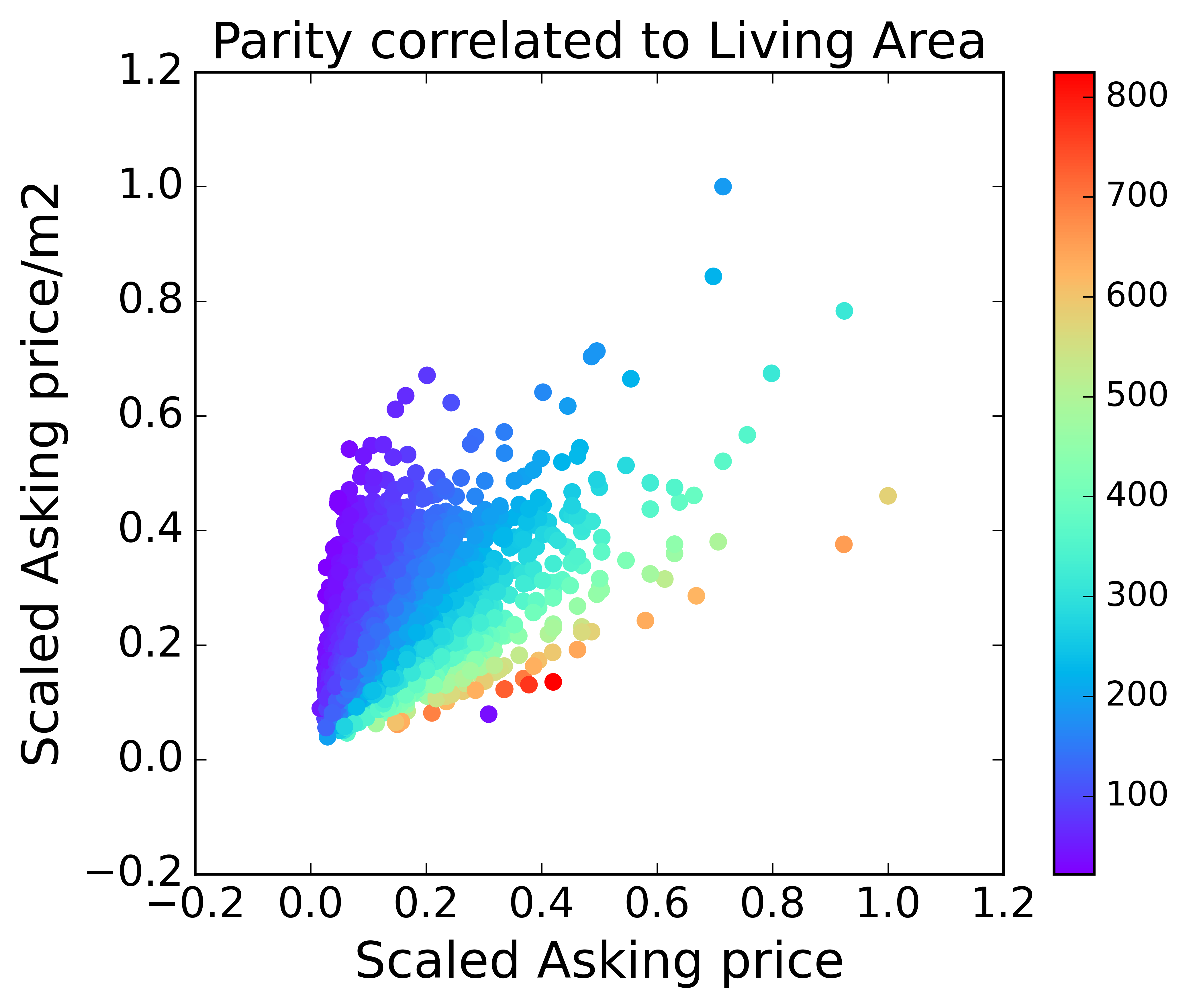
The next logical question is how the prices of these houses are determined. To understand this, I created a parity plot of Price vs. Price per m2. To build a consistent parity, I 'scaled' the prices in an aforementioned category by their respective maximum values leading to a number between 0 and 1 for each category. Then, the color of the data points have been chosen using a colormap that corresponds to the value of any parameter of choice that I would like to find correlations of. This trick allows me to compare three parameters into a very simple 2D plot. Using this I first investigated the dependency of the pricing on the “Living Space” (Fig 3(a)). Very Interesting and very surprisingly, I see that there is a direct and clear correlation between the asking prices, price per m2 (rate), and the living area. The colormap pattern (Fig 3 (a)) shows that price per m2 is computed by directly dividing the asking price by the living area where the color bar represents the living area in m2.
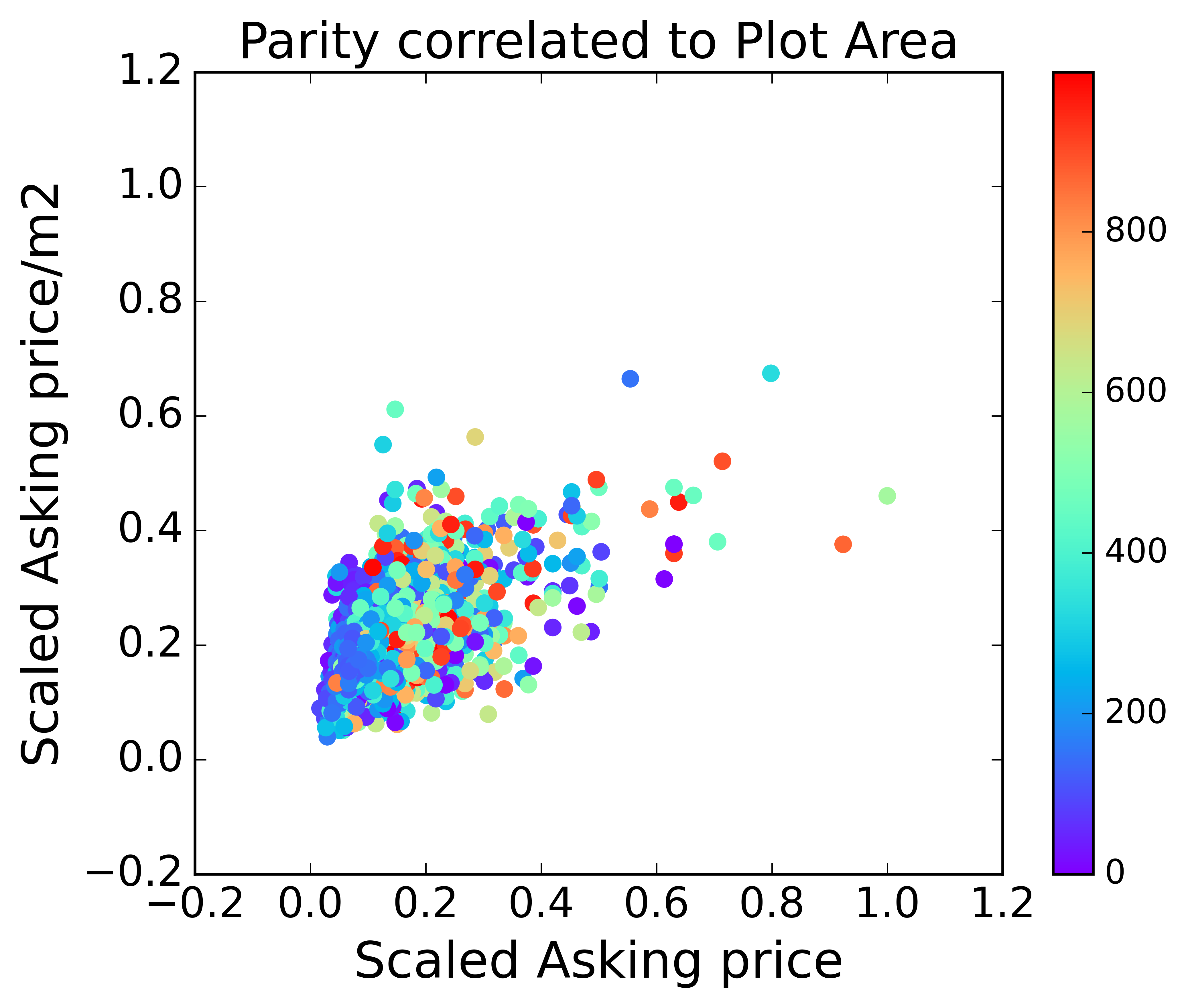
What is even more surprising is that there is NO correlation in the case of the total plot area (see fig 3(b)). This is very counterintuitive as we may think that the cost would correspond to the land we buy (which is typically in my country of origin -India) and many other countries. Some of you might point out that there is some correlation for smaller plot areas … to which I agree because they typically correspond to apartments (not bungalows) with smaller areas which of course have no extra area other than the living area.
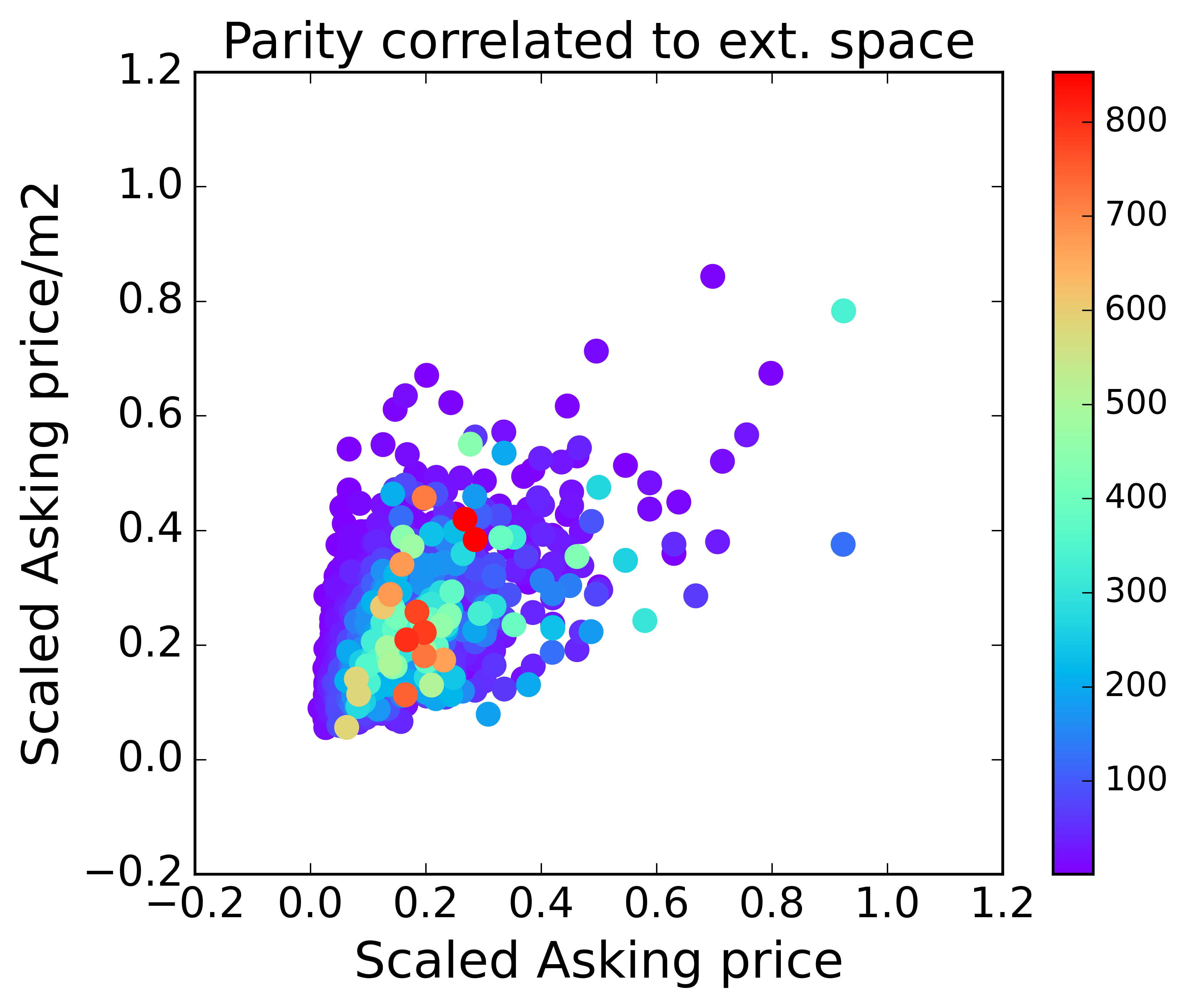
Furthermore, I would like to have a house with some extra space outside to barbeque in nice weather, sit in the sun or park my car (if I buy it some day …). It seems that getting this extra space is purely based on luck as can be observed from the fig 3(c). which again shows no correlation in the external storage space.
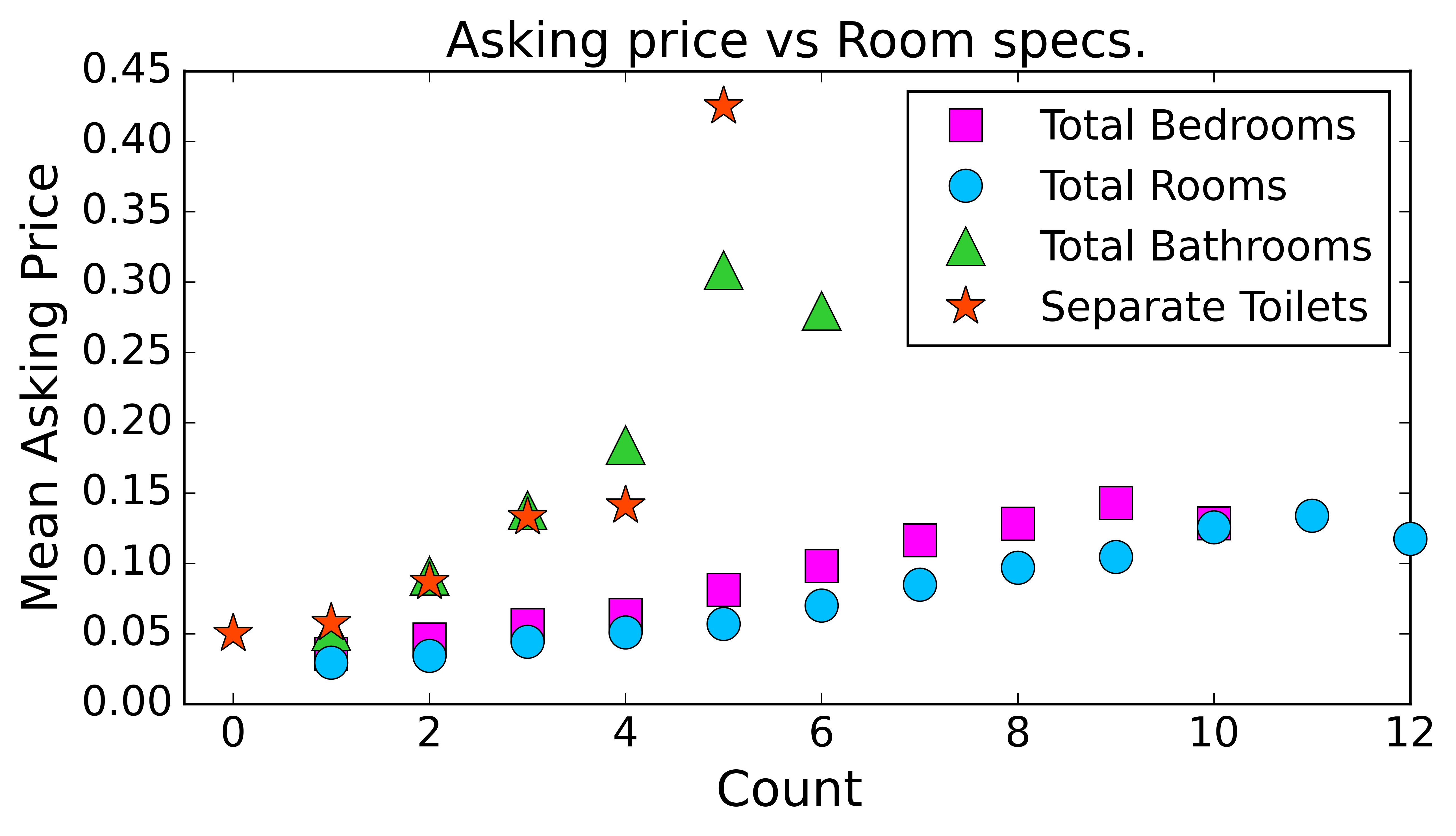
Moving on, in the case of the house contents, as expected the price of the house increases with more amenities like extra rooms, bathrooms, toilets, etc. (see fig 4(b)). However, what caught my attention when I plotted the same data now w.r.t. the price per m2 as shown in fig. 4(a).
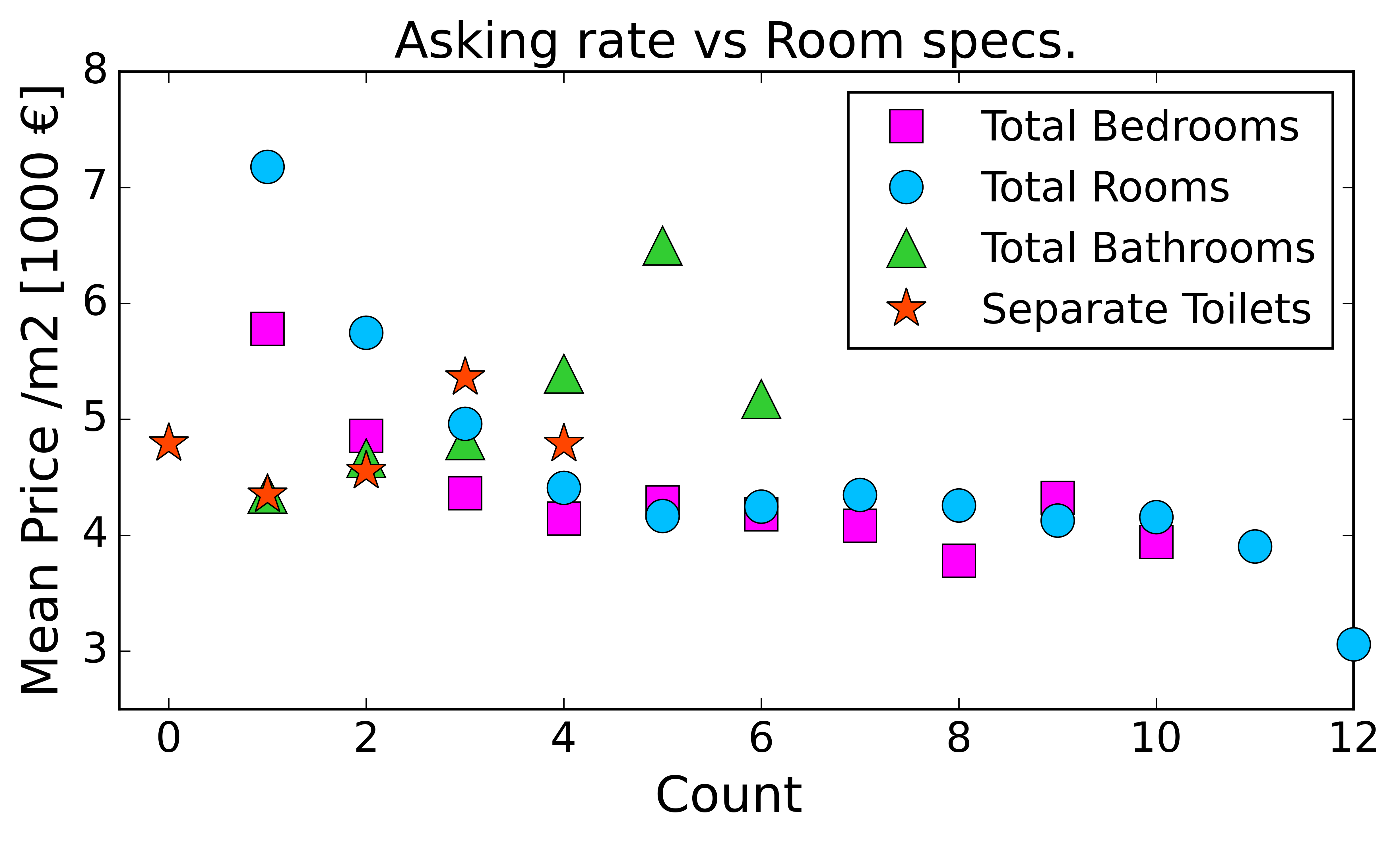
It seems that is economically rewarding to buy a house with more number of rooms as the price per m2 drops significantly as the number of rooms increases. This means one needs to pay proportionally less for every extra room. Thus, people with bigger budgets have more benefits as they can purchase bigger property (more rooms) and pay proportionally less for the extra rooms, one of the stark realities of a capitalistic society.
However, irrespective of the price, it is super expensive to have that extra bathroom or separate toilet. The asking prices and the asking rate both increase exponentially with the number of bathrooms and toilets
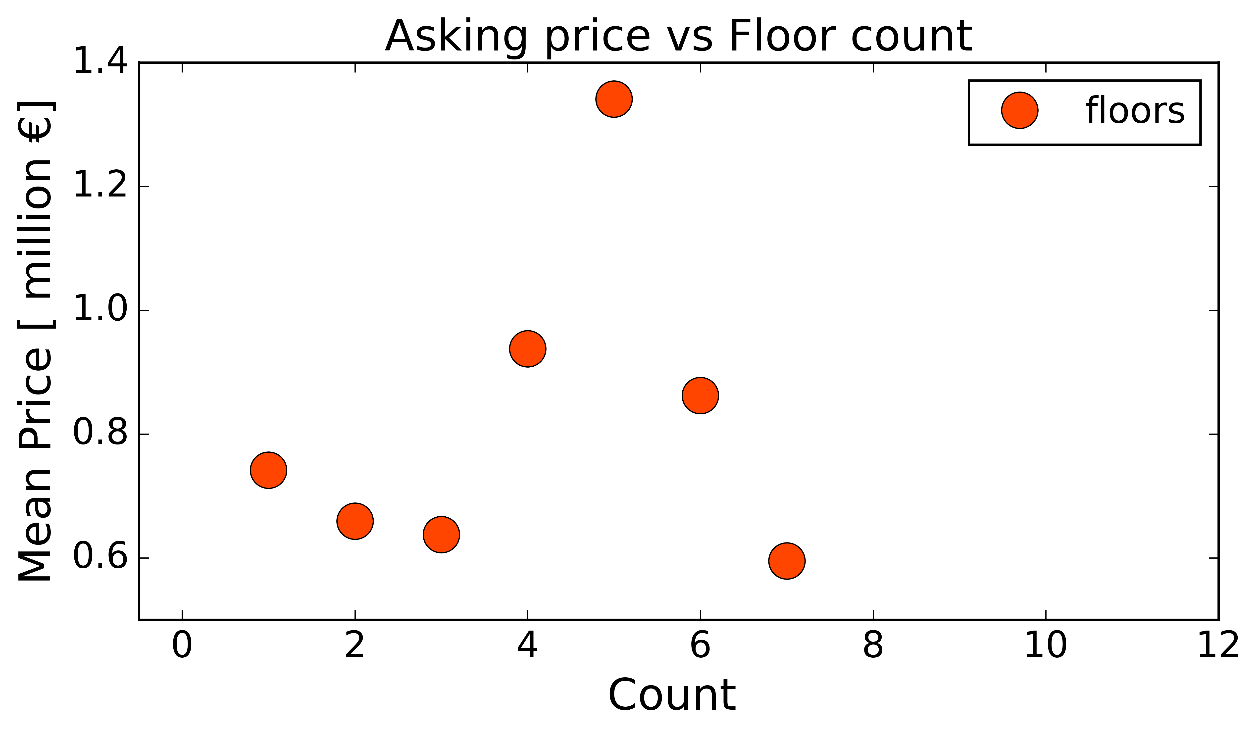
Also, the price of the house increases somewhat with the number of floors but after 5 floors, the prices actually drop. I am still trying to figure out why … One possibility is that sometimes the listing website lists the number of floors and the floor number at the same position which might make this data a bit controversial... If you find some insight feel free to ping me:).
Finally, the million-dollar question, how does sustainability affect the pricing? This is a very important aspect since the mortgage price is affected by the energy label of the house.
To understand this, I have split the data for the subsequent analysis (in fig 6(a) and (b)) into two parts. This splitting has two important reasons:
- First, 'Median Prices' are a better indicator of these trends since high or low prices and undesirably influence these statistics in these cases.
- Second, for most energy labels, the data distribution is mostly lognormal, thus this method effectively treats the mean and the tails as different cases.
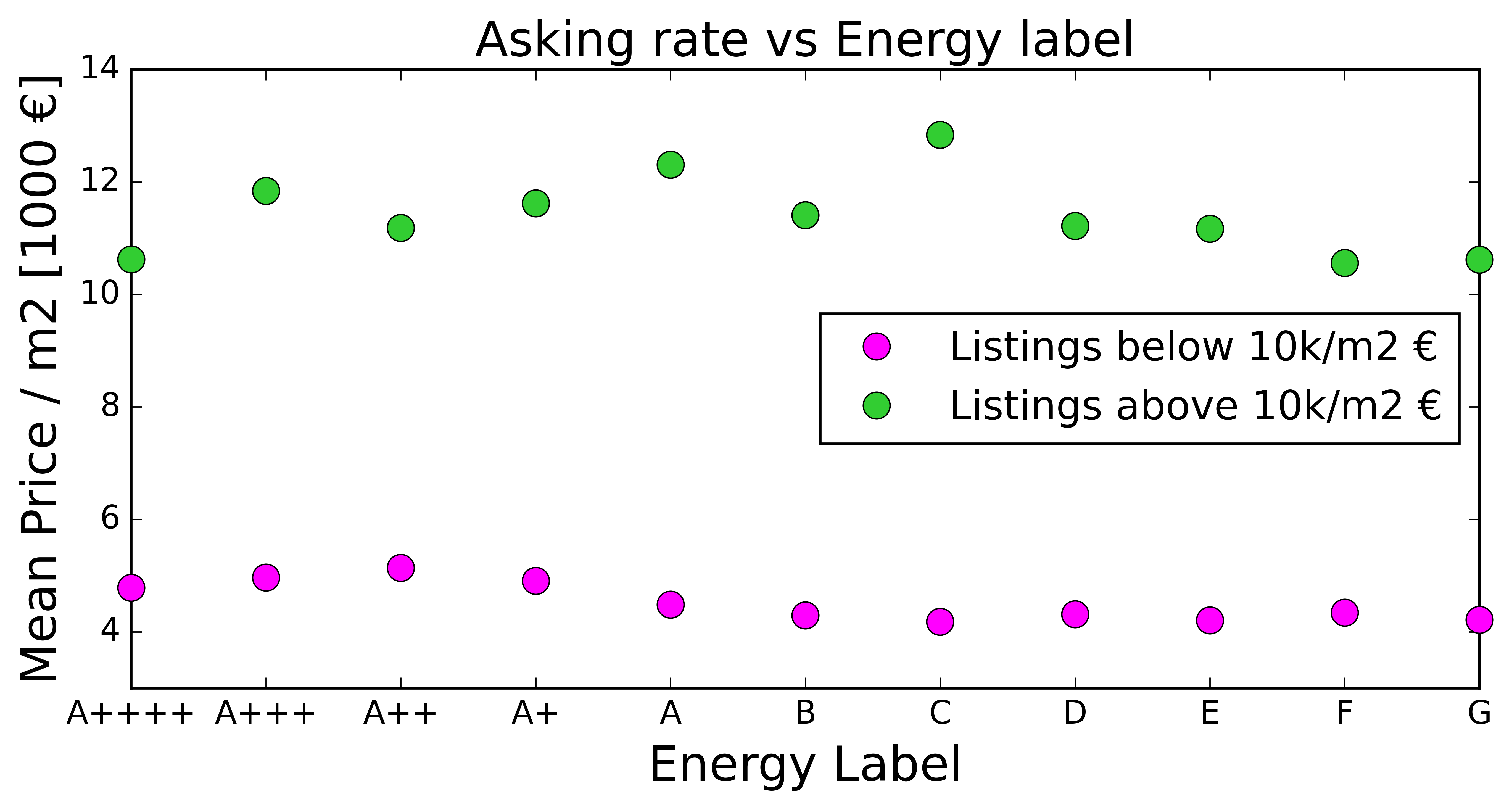
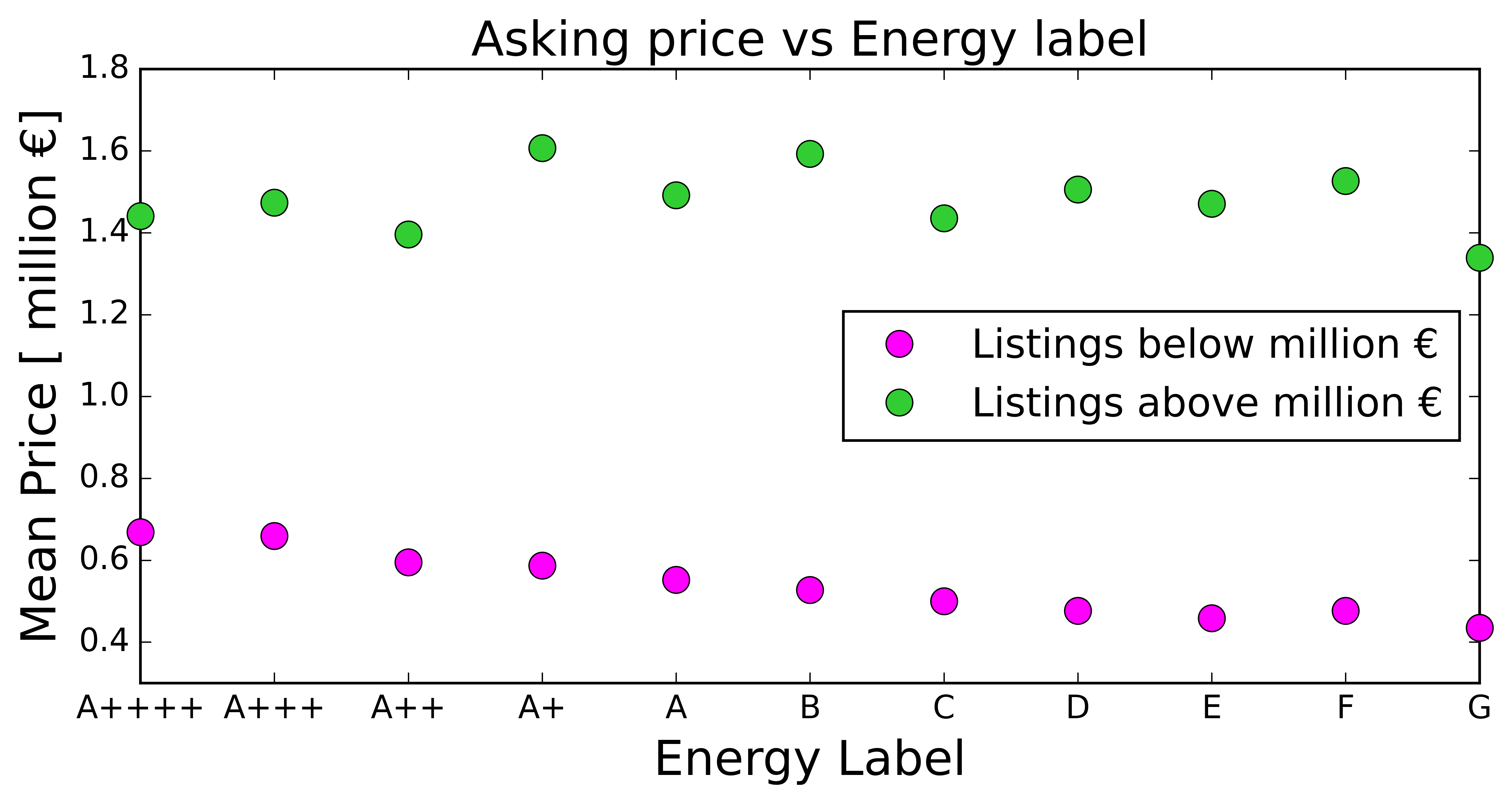
Fig 6(a) compares the mean price per m2 (rate) to the energy label. The data is divided into costs above or below 10k euros/m2 to represent houses in expensive locations (where price pr m2 is generally high) or higher-end houses (better equipped and maintained houses) vs cheaper localities or low-end houses. To my surprise, for the lesser cost per m2, a better energy label means more price per m2 but there is no dependence on the more expensive pricing.
Similarly, if we now compare the average asking price, I have split the data between those priced over '1 million' euros and those below. Apart from statistical relevance, those above 1 million are nearly impossible for first-time buyers to purchase and even for upper-middle-class households and you need more than a good salary to buy them (generational wealth??).
Again, we see a similar trend where affordable houses (less than 1 million) are more expensive in general if it is of better energy label. This will discourage people from opting for sustainable (energy efficient) houses even though the mortgage rates are lower for them as they end up paying the same monthly amount (due to the higher asking price).
To conclude, I did learn very surprising trends in the housing market. To summarise, cheaper houses are more likely to be older and have lower energy labels. Very expensive abodes will more likely be new and may or may not be energy efficient. More rooms mean more price efficiency, while more toilets mean less price efficiency. Finally, 'een schuur of een tuin wordt een bonus'... You can see that you are most likely not priced for them (so good and bad simultaneously, based on which end of the market segment you are). These findings are summarised in the dashboard at the end. And, thanks for reading patiently till the end ...